An observation on a recent episode of the Skirious Problems podcast caught my attention, as it seemed to be something that was pretty easy to verify quickly.
Basically, they noted that the qualification times in the Davos freestyle sprint, at least on the men’s side, were very tightly packed together and that it seemed as though qualifying for the heats had gotten more difficult in the last several years.
My interpretation of this is that they mean that in order to qualify for the heats you need to be closer to the fastest qualification time. I could be wrong, but that’s how I heard it at least.
This is easy to visualize by plotting the qualification time percent back of the 30th best qualification time across all World Cup sprint races. In the plot below I’ve actually started in the 2006-2007 season to remove most of the early experimental sprint events.
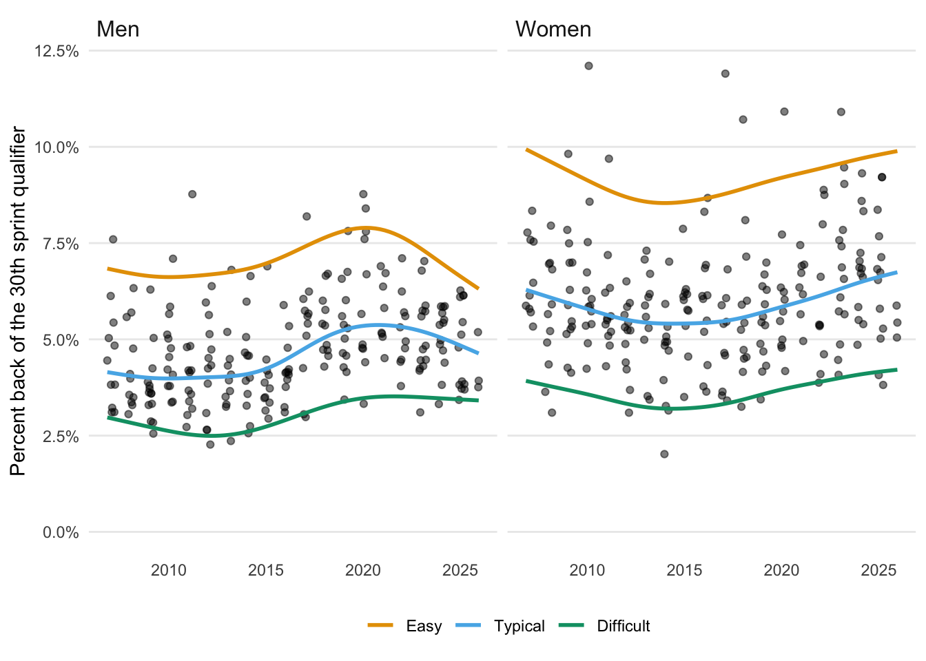
Before we talk about the colored lines, let’s just focus on the points. The first thing to note is that there’s a lot of variation from race to race. By that I mean that the percent back cutoff for qualification generally ranges between 2.5% - 7.5% for men and 3.0% - 9.0% for women (roughly).
The course, the snow conditions & weather, and the particular mix of skiers at that race have a huge effect on how competitive qualification is, at least as measured by the percent back of the 30th qualifier. So it’s really dangerous to pick out one race and treat it as an indicator of a trend.
Now let’s turn to the colored lines; what’s up with them? Since there’s so much variation in qualification competitiveness, we can expect that in any season some races will be fairly easy to qualify in, some will be quite hard and most will be somewhere in the middle. These three things could be trending in different directions!
So what I’ve done above is fit trend lines to the 95%-tile, the 50%-tile (median) and the 5%-tile percent backs (percent’s back?) and labelled them “Easy”, “Typical” and “Difficult”.
The simplest to understand is the median, the blue line. These are your “typical” World Cup sprint races. And here, Mika & James from Skirous Problems appear to be onto something. The median percent back of the 30th male qualifier has indeed been trending down in the last several years, albeit slightly.
More dramatic is the apparent shift in the “Easy” sprint races for the men, the orange line. I was initially suspicious of this, given that it seems to be largely driven by a cluster of particularly weak qualification fields in the 2020 season.
My first thought was that maybe they were a bunch of sprint races in unusual locations (China, Russia, Canada, US) that see significantly smaller fields. But they aren’t, they are just the regular, pre-pandemic 2020 sprint races. I don’t have time to dig into that further, but it’s curious.
Working slightly against Mika & James is the mostly flat trend of the “Difficult” sprint races, the green line.
What we’re left with is the broad conclusion that yes, the typical men’s sprint race has been getting somewhat more competitive in recent years. However, the most recent Davos race, being very competitive, isn’t really a good illustration of that trend, as the level of the competitive sprint qualifiers has remained pretty stable.
Now that we understand how the plot works, the picture on the women’s side is a bit more straightforward. Here, qualification has actually been getting steadily easier across the board for almost a decade now. And after writing that sentence, I will be very sure to try to avoid any female World Cup sprinter who likely wants to punch me now. I’m sorry!